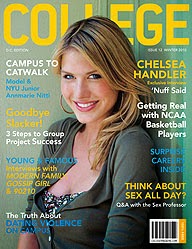
Masthead: College, the name of the magazine.
Price & Barcode: Bottom right hand corner, tells us how much the magazine is.
Date: Underneath masthead, tells us the date of publication.
Sell Lines: Over the main image, these draw the reader in and tell us what is inside the magazine.
Main Photo: Biggest image on the cover, the main focus of the cover.
Plug: A reason why a person should buy the magazine, usually a chance to win something (kind of like a bribe)
 LIIAR Analysis:
Language: The main image is a medium long shot, the girl is the main focus of the magazine. She looks straight at the reader drawing in them in. She is smiling giving a positive image.
Ideology: College is a laid back and happy place, the girl in the image is wearing denim shorts and is smiling, giving positive connotations.
Institution: 'College', may be a specific college's magazine
Audience: I think that this magazine is aimed at students because the stories would appeal to students rather than parents or teachers
Representation: The college is being represented as a happy place because the image is bright, and the girl in the main image is smiling
LIIAR Analysis:
Language: Medium close-up, the main focus of the image is the girl, she is looking at you, making you want to buy the magazine.
Ideology: Happiness and sincerity because the girl in the main image is smiling and is holding eye contact
Institution: 'College', it could be for a specific college
Audience: Again I think this is aimed at students because of the stories, I don't think teachers or older people would be that interested in the stories.
Representation: I think the girl is meant to be a student, she represents the student body and it shows that students at the college enjoy their time there.

Language: The main image is a medium close up shot, the image is fairly light, plain and simple background keeping focus on the girl in the image. The main colours are blue on the cover being quite bright and fresh.
Ideology: College is simple, there isn't much going on in the image, it gives the impression that college isn't hard work, anyone can do it.
Institution: 'Student' magazine
Audience: I think that again the magazine is aimed at students, because of the name and because of the stories and main image. The stories featured on the cover are there for the benefit of students, for example 'Top 10 Ways To Help You Revise' this story would not appeal or be helpful to anyone who was not in education. The young girl in the main image is probably a student therefore making the magazine more relatable.
Representation: Again because I think that the girl is a student, she could be representing all the students at the specific college, she is smiling therefore saying that all the students at the college are happy there and enjoy learning at the college.