Tuesday, 22 October 2013
Saturday, 19 October 2013
Conventions & LIIAR Analysis: Front Cover, Contents Page & Double Page Spread
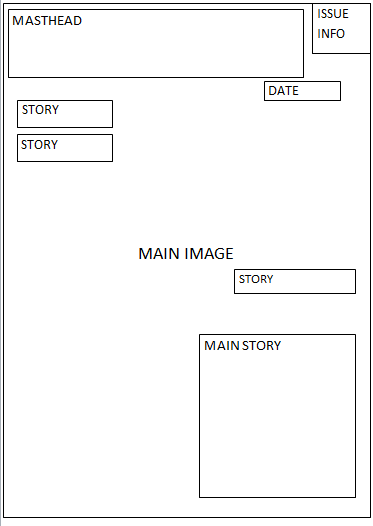
 The front cover of 'Top of the Pops' magazine includes many typical conventions, I have noted some of these on the diagram opposite.
The magazine includes a masthead which is at the top of the page and stands out, this makes it easily recognisable to regular readers, and for new readers they can easily see the name of the magazine they are buying.
I believe that this magazine is aimed at young females because of; the colours scheme, the stories and the plugs.
I think that the colour scheme reflects the target audience as they are bright and cheerful colours that would be more attractive to girls.
I think that the stories on the cover appeal to a young female audience because for example the '89 celeb looks' story would appeal to females who are interested in what celebrities are wearing. Underneath this story it says 'to copy' this suggest that the article will be informative as well as interesting. Young girls who want to look like their style idol would like this article as it will show them how to have similar style to their favourite celebrity. Other cover lines on the cover feature big names in music reinforcing the fact that the magazine is specifically a pop magazine.
The plugs on the cover would appeal to a teenage audience because I believe that what they are offering would most likely appeal to this age range. They are offering '10 Cool Posters' and the examples they give to the side of the plug are of famous pop stars, one of a girl band member who they may see as a role model and one of a band member with no shirt on that young girls would probably find attractive.
I think that the main image works well for the magazine as it is of Selena Gomez, a famous pop star that many people would recognise any of her fans would be interested in buying the magazine to find out what she has to say in it. The main story links to her, the story also reinforces the fact that she is well known because it simply says 'from Selena' indicating that people would know who she is just from the picture and her first name.
The cover also includes a skyline which has another feature story , it also includes the institution in which the magazine comes from, the 'BBC' logo is located in the top left hand corner of the magazine, on the skyline.
 The contents page of the 'Top of the Pops' magazine also features common conventions. I have labelled some of these on the diagram on the left.
 The masthead at the top of the page clearly indicates to the reader what this page consists of. It takes up a lot of room and stands out so it is clearly visible.
An actual image of the cover is one the contents page and page numbers are located next to the featured stories, this makes it easier for readers to know where the main articles are in the magazine.
The page is split up into sections, above each column of articles is a subtitle telling the reader what the overall subject of that column is, this would be helpful to the reader as they can easily find specific articles that they would like to read.
There are pictures on the contents page which relate to stories on the page. Some of the pictures on the page have no story with them indicating that the reader will be able to tell what the article will be about just from then photo.
In the columns of articles the main feature of each story have been highlighted in order to make it stand out and easier for the reader to see what the story is mainly about.

This is a double page spread taken from 'Top of the Pops' magazine. On the image to the right I have identified some the key conventions it has.
The title of the page reads 'Steal Her Style', it does not say who she is but we can guess by the link to the main image. The image on the right hand side of the page is the main image. It is the biggest on the page and is of Bella Thorne, so we can guess that hers is the style we are going to be 'stealing'.
The double page spread also includes page numbers which allow the reader to easily navigate the magazine and find things from the contents page.
Underneath the images of Bella Thornes style on the left page there are subtitles, giving the reader a name for each style and an idea of what style it is. They also title the text underneath which is the main feature of the spread as this is the information in the article that the readers are interested in. Relating images are located next to the text so the reader can get a visual idea of what product is being talked about.
Quotes from Bella Thorne are located around the page, this allows the reader to see clearly important or interesting quotes from the article.
My Chosen Genre
I have chosen to make a music magazine of the pop/chart music genre because I feel that it has a wide audience of all different ages and I think I could come up with many ideas that would suit all different age categories.There many existing magazines of the pop genre that I think I could get inspiration from, I think that I have the most knowledge of this type of music which will help me make good decisions about my magazine.
 For example, the magazine in the left 'We heart Pop' contains a famous face, Jessie J even people who don't like this genre would be likely to know about her as she is in the media a lot. I think that because I know more about this genre I could make it either very broad and make it appeal to a wide target audience or make it fairly specific.
Here I have the iTunes Pop Chart for the week beginning 13th October 2013:
1. Counting Stars - One Republic
2. Wrecking Ball - Miley Cyrus
3. Bonfire Heart - James Blunt
4. Juliet - Lawson
5. Roar - Katy Perry
6. Can We Dance - The Vamps
7. Disco love - The Saturdays
8. Burn - Ellie Goulding
9. R U Crazy (Radio Edit) - Conor Maynard
10. The Fox (What Does The Fox Say?) - Ylvis
Most of the names of the artists on this list would be recognisable to most people as they are fairly main stream and pop music often dominates radio stations.
For example, the magazine in the left 'We heart Pop' contains a famous face, Jessie J even people who don't like this genre would be likely to know about her as she is in the media a lot. I think that because I know more about this genre I could make it either very broad and make it appeal to a wide target audience or make it fairly specific. Here I have the iTunes Pop Chart for the week beginning 13th October 2013:
1. Counting Stars - One Republic
2. Wrecking Ball - Miley Cyrus
3. Bonfire Heart - James Blunt
4. Juliet - Lawson
5. Roar - Katy Perry
6. Can We Dance - The Vamps
7. Disco love - The Saturdays
8. Burn - Ellie Goulding
9. R U Crazy (Radio Edit) - Conor Maynard
10. The Fox (What Does The Fox Say?) - Ylvis
Most of the names of the artists on this list would be recognisable to most people as they are fairly main stream and pop music often dominates radio stations.
Tuesday, 15 October 2013
Initial Thoughts About Music Magazines
Genre:
 Existing Products:
- Country
- Rap
- Jazz/Blues
- Chart/Pop
- Electronic
- Dance
- Rock
- Hip-Hop
- Metal
- R'n'B
- Indie/Alternative

 Existing Products:
- NME
- UnCut
- Mojo
- Top of the Pops
- Kerrang
- Vibe
- Billboard
- Rolling Stone

Conventions:
- Masthead
- Skyline
- Sell Lines
- Main Image
- Plug
- Main Story
- Date
- Footer
- Price
- Barcode
Target Audience:
- Age
- Gender
Monday, 14 October 2013
The Brief - Music Magazine
Main Task: The front page, contents and double page spread of a new music magazine. all images and text used must be original, produced by you - minimum of four images
Sunday, 13 October 2013
Evaluation
When I studied both college magazines
and magazines available in a high street shop with a similar target audience I
saw that they both contained the same features. When I was creating my own cover
for a college magazine I included many of these conventions, however on the
cover I did not want to include a barcode as I personally don’t think they look
good on a cover. If I was to develop this magazine I would have the barcode on
the back cover.
I
chose to have red and white coloured font on my cover because my magazine is
aimed at both genders and I feel like these colours don’t gravitate to a
particular sex, for example I think if I used pink writing on my cover then
males would be less likely to buy the magazine.
I
think my magazine represents teenagers in education because I tried to make it
as relatable to this age group as possible, for example I asked my friend Tara
to be the model for the cover because I wanted my cover to be relatable to the
readers and as Tara is a student I felt that it would make the magazine more
personal. I also wanted this to be the case with the name of the magazine, I
chose ‘Student’ because it’s something that all the people who the magazine is
available to have in common and as previously mentioned I think it makes it
more relatable.
I
have tried to make the cover eye catching by increasing the brightness of the
main image and making the text stand out by using shadowing effects. When I was
looking at existing products I saw that some had specific themes for a specific
issue, I thought I would try this and decided to go with ‘transport’ because
all students have to get to college in one way or another so I thought that it
would appeal to a wide audience and the articles could be informative and
entertaining. I thought about other themes such as ‘college fashion’ but I
didn’t think it would appeal to as many people. Although the magazine is aimed
at students I think that students and parents would be interested in buying it
too because I think that the magazine looks quite sophisticated and not
childlike.
After
looking back at my perfume ad I think I have improved my Photoshop skills
because I think the overall appearance of the project looks a lot more professional
than the perfume ad, however I still think that I am getting used to how it
works as it took me a while to get all the elements just how I wanted them.
I
think if I was to do this project again I would make the focus of my main image
a bit bigger as the background take up most of the frame, I like the name of my
magazine so I would keep that but maybe I would change the font colour to
purple to fit in with the theme of Wyke as this the colour of their logo. I
also think that I would screen shot my progress along the way and upload it to
my blog because although I posted the required tasks there I think if I could
show the entire process it would make it a lot clearer.
Overall
I really enjoyed doing this project, I found it really interesting and fun. After
reflecting on this task I now know what things I can improve on for the next
one!
My Final Front Cover

This is my final front cover, I am really happy with the way in which it turned out, I felt I fulfilled the brief and I really enjoyed this project.
Saturday, 12 October 2013
Un-Used Shots
I haven't used these shots because although they fit in with my chosen theme they are not in portrait format meaning that they would not be good photos for a front cover. I got my model to look at the camera on the first image so that it engaged with the reader however I felt that it didn't look authentic and looked a bit forced.


I also decided not to use the photos below because I had decided that the main theme of this magazine would be transport and these pictures don't link with this theme. I think that the picture I chose in the end was a lot more interesting, and you can definitely see the theme from the picture whereas these images are quite vague.


I decided not to use this shot because although it very similar to my chosen shot I thought that the lighting on the image I chose was better.


Thursday, 10 October 2013
Conventions of a Contents Page
On the diagram underneath on the left I have identified some key conventions of the cover.
I have noted some key features of a contents page on the diagram underneath on the right.


- The Masthead from the front cover is repeated onto the contents page in the same font this shows continuity.
- The page numbers on the contents page are larger then the print making it clear to the reader what story is on which page.
- The 'On the Cover' bubbles clearly indicate to the reader what are the feature stories that they had seen on the cover.
- The main feature in each story has been put in bold which helps the reader see easily what this is.
- The overall subject of what the stories on this page are, is featured clearly in the side of the page, this makes it easy for the reader to know what stories are related to
- The picture on the page relates to the story so the reader can get a visual interpretation of what the article will include.
Sunday, 6 October 2013
Saturday, 5 October 2013
Examples of Shot Types

I created the diagram to the left to show the different types of shots. For the college magazine project I have to produce a front cover with a medium close-up shot.
The images below are all example of medium close-up shots:


The images below are examples of close-up shots:


The images below are all examples of extreme close-up shots:


Subscribe to:
Posts (Atom)