 The front cover of 'Top of the Pops' magazine includes many typical conventions, I have noted some of these on the diagram opposite.
The magazine includes a masthead which is at the top of the page and stands out, this makes it easily recognisable to regular readers, and for new readers they can easily see the name of the magazine they are buying.
I believe that this magazine is aimed at young females because of; the colours scheme, the stories and the plugs.
I think that the colour scheme reflects the target audience as they are bright and cheerful colours that would be more attractive to girls.
I think that the stories on the cover appeal to a young female audience because for example the '89 celeb looks' story would appeal to females who are interested in what celebrities are wearing. Underneath this story it says 'to copy' this suggest that the article will be informative as well as interesting. Young girls who want to look like their style idol would like this article as it will show them how to have similar style to their favourite celebrity. Other cover lines on the cover feature big names in music reinforcing the fact that the magazine is specifically a pop magazine.
The plugs on the cover would appeal to a teenage audience because I believe that what they are offering would most likely appeal to this age range. They are offering '10 Cool Posters' and the examples they give to the side of the plug are of famous pop stars, one of a girl band member who they may see as a role model and one of a band member with no shirt on that young girls would probably find attractive.
I think that the main image works well for the magazine as it is of Selena Gomez, a famous pop star that many people would recognise any of her fans would be interested in buying the magazine to find out what she has to say in it. The main story links to her, the story also reinforces the fact that she is well known because it simply says 'from Selena' indicating that people would know who she is just from the picture and her first name.
The cover also includes a skyline which has another feature story , it also includes the institution in which the magazine comes from, the 'BBC' logo is located in the top left hand corner of the magazine, on the skyline.
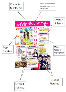
 The contents page of the 'Top of the Pops' magazine also features common conventions. I have labelled some of these on the diagram on the left.
 The masthead at the top of the page clearly indicates to the reader what this page consists of. It takes up a lot of room and stands out so it is clearly visible.
An actual image of the cover is one the contents page and page numbers are located next to the featured stories, this makes it easier for readers to know where the main articles are in the magazine.
The page is split up into sections, above each column of articles is a subtitle telling the reader what the overall subject of that column is, this would be helpful to the reader as they can easily find specific articles that they would like to read.
There are pictures on the contents page which relate to stories on the page. Some of the pictures on the page have no story with them indicating that the reader will be able to tell what the article will be about just from then photo.
In the columns of articles the main feature of each story have been highlighted in order to make it stand out and easier for the reader to see what the story is mainly about.

This is a double page spread taken from 'Top of the Pops' magazine. On the image to the right I have identified some the key conventions it has.
The title of the page reads 'Steal Her Style', it does not say who she is but we can guess by the link to the main image. The image on the right hand side of the page is the main image. It is the biggest on the page and is of Bella Thorne, so we can guess that hers is the style we are going to be 'stealing'.
The double page spread also includes page numbers which allow the reader to easily navigate the magazine and find things from the contents page.
Underneath the images of Bella Thornes style on the left page there are subtitles, giving the reader a name for each style and an idea of what style it is. They also title the text underneath which is the main feature of the spread as this is the information in the article that the readers are interested in. Relating images are located next to the text so the reader can get a visual idea of what product is being talked about.
Quotes from Bella Thorne are located around the page, this allows the reader to see clearly important or interesting quotes from the article.
No comments:
Post a Comment